A few years ago, the world-famous Brandon Stroud and I wrote an article running down the 40 worst Rob Liefeld drawings of all time. For a not-insignificant period of time, that article was the top Google result for "Rob Liefeld," which I still consider to be one of my greatest accomplishments in life. It's still in the top two or three results returned in just about any search engine if you type in his name.
But beyond the fact that Rob Liefeld has never stopped being one of the most famous and best-selling comic book artists FOR TWENTY YEARS NOW, the joke was on us (not really), because our dear friend has never stopped putting out work. Do you know how many drawings a comic book artist pumps out over the course of 20 years? SO MANY DRAWINGS. So the truth of the matter is that there can never truly be a 40 "Worst" Rob Liefeld drawings until the dude is dead and gone and his remains have been blasted into the sun in a gold-plated space shuttle with diamond-encrusted control panel. Maybe not even then. There are so many awful Liefeld drawings that B and I could probably do a list of 40 every other month, forever.
But B and I have managed to channel our rage for you and review another 40 of the very worst Rob Liefeld drawings we could find. The results appear below, in no REAL order, because if looking at one drawing gives you a nosebleed and looking at the next drawing gives you a burst blood vessel in your eye, which is worse? The answer: Rob Liefeld. Please enjoy this terrible art. Click to embiggen smaller images.
All images are copyright Rob Liefeld, because who else would willingly admit they drew this stuff?
40.
A one act play:
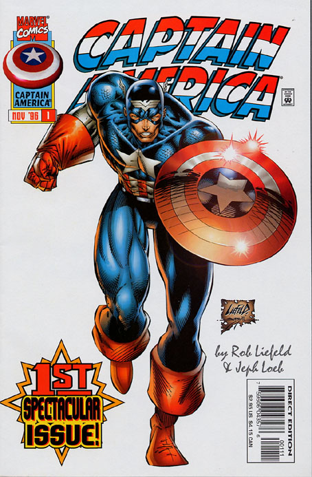
Marvel: "Rob, you're drawing Captain America #1!"
Rob: "psheww pshewww" /makes rubber ducky sink battleship
Marvel: "Any ideas for the cover?"
Rob: "cap'n merica"
Marvel: "Doing what?"
Rob: "uhhhhhhhhhhhhhhhh"
AND THEN HE WAS COMPLETELY OUT OF FUCKING IDEAS. Seriously, look at that thing. Liefeld put more effort into that shitty free-hanging scroll with LIEFELD on it than he put into drawing Captain America. My working theory is that he started drawing from the feet up and was feeling pretty good about it, but if he drew in a neck and made Cap's head the right size it would cover up too much of the title, and he'd already drawn some bad ass glove folds, so he just put a tiny baby head where the throat hole should be. I don't care how muscular you are, I don't care if you're the MOST muscular, there is no feasible anatomical situation where both the front and back of a person's torso should be seen at the same time. Especially when they're looking up. They should put Liefeld in charge of drawing Catwoman. At least then he'd have an excuse to draw people gritting their teeth.
While we're at it, was Rob Liefeld raised in Santa's Village? Because every pair of boots he draws has big elf folds around the calf, like they were given thigh-highs and pushed them down for comfort. It might also explain him not understanding how light works, as evidenced by the three random goddamn lens flares on Cap's shield. Good job putting the guy who makes everybody look like buttfucked monsters in charge of drawing your good-hearted patriot, Marvel.
39.
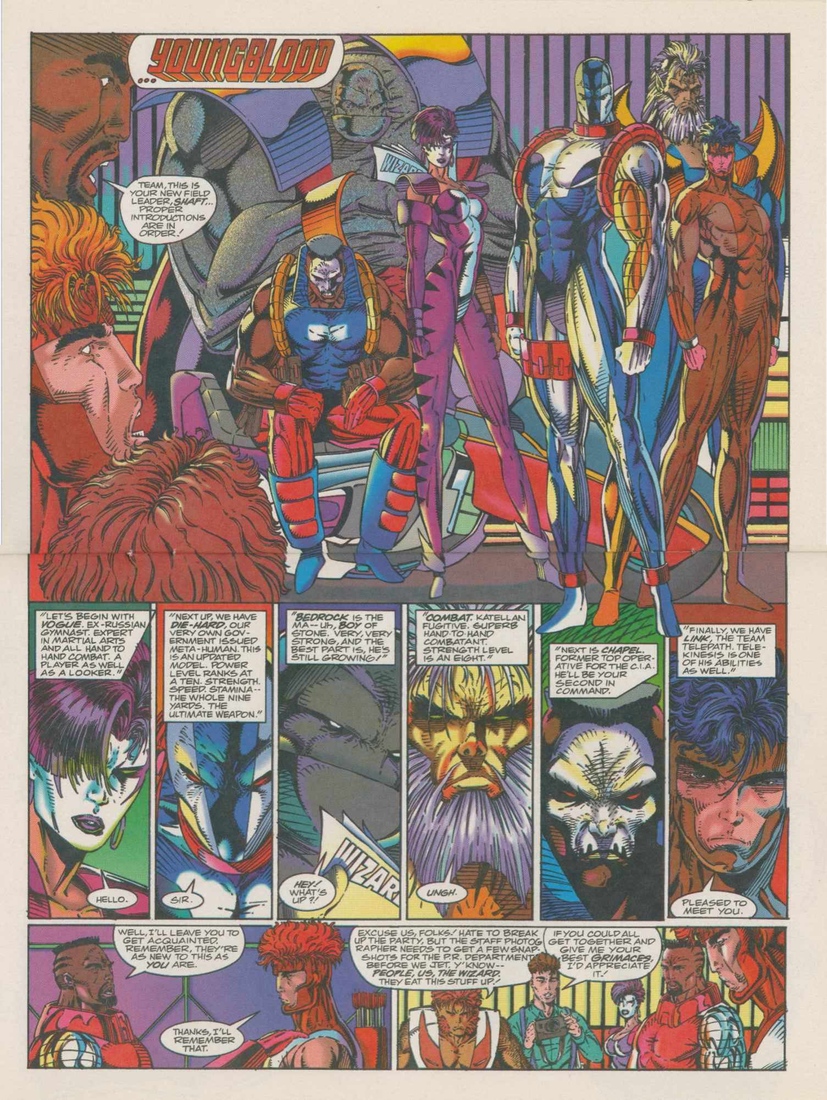
This is from Youngblood #0, and this is the page that shows how the crack weirdos of Youngblood got together (spoiler: Shaft was put in charge of an existing team. Yayyyyy). When I was a kid reading comic books in the early 90s, I literally thought that how you told a comic book story was you had a bunch of people that already had crazy powers, and introduced them to each other, taking the time to say their name in such a badass way as to verbalize their team typeface or logo. I wrote and drew a sad amount of comics that featured this formula, and I am blaming Rob Liefeld for all of it.
In the first panel, Chapel just looks SO SAD. Probably because the fingers of his left hand are all out of order and because his legs don't meet up with his body. Look at the purple lady in the first panel ("Vogue." No idea where he ever would have come up with an idea for a name that clever). Her right foot is possibly the tiniest Liefeld-foot ever actually shown on-panel. It's gotta be hard being a gymnast when one of your feet is a size eight and one of your feet is a size one.
Liefeld does something else that bothers me more than it should. Badrock is reading an issue of Wizard magazine on these pages (heh, get it) and the name of the magazine is on what should clearly be the back cover. Motherfucker, not even Highlights magazine puts the name of the magazine on the top of the back cover. And this asshole does this TWICE in TWO SEPARATE PANELS in this spread. Couldn't even flip Badrock for the closeup? Jesus. My anger is only further exacerbated in the final panel, when they refer to the magazine in the dialogue as "THE" Wizard. Argh what
38.
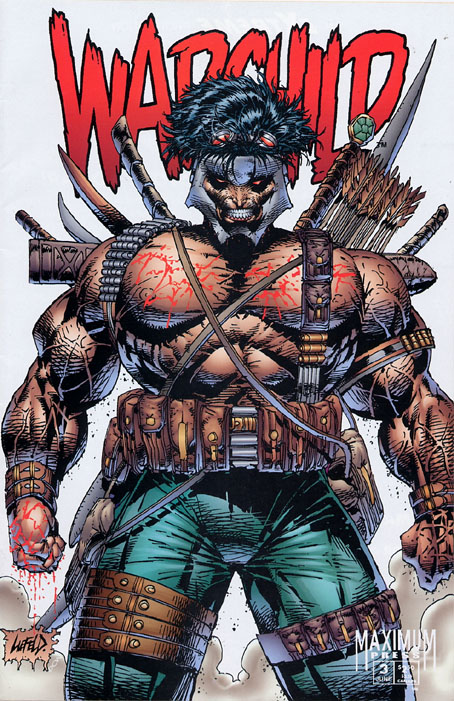
Warchild! He's so muscular his pecs are trying to tear their way out of his chest! So muscular a pair of leather watches (?) squeeze off the circulation on his arms and blood comes out of his hands! It's like somebody making sausage! WARCHILD, THE CHILD OF WAR.
You can tell he loves war because he's carrying every weapon Liefeld could think of, whether it makes sense or not. I like that some of the swords are strapped on in one direction with a bunch strapped in the other, so whenever Warchild reaches over his shoulder he's guaranteed to slice his hand in half. Maybe THAT's why he's bleeding from the hands. I wanted to make a joke about him having a thousand arrows and no bow, but I think that sword behind them is the bow. Haha is he carrying the bow in the quiver? Or is "behind the arrows" just the best place to carry a bow? Why am I asking the guy who wore teal pants, pointy metal headgear and goggles to war but forgot his shirt?
Pop quiz: Do you know what Warchild holds in all those pockets? WAR.
37.
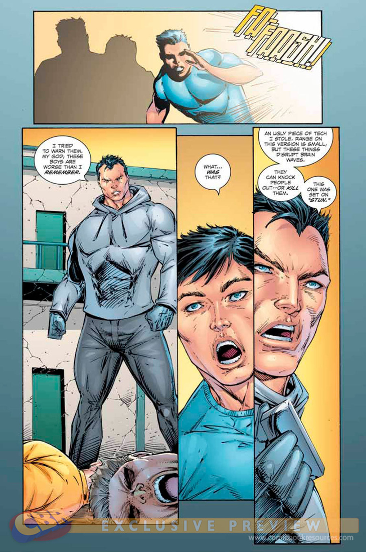
FA-FOOSH indeed!
Rob Liefeld's characters can possess one of two emotions: clenched-teeth scowling, or mouths WIDE-THE-FUCK-OPEN. Sometimes both at once! But that's it. Those are the only facial expressions our dear artist is aware of. One thing that he particularly does all the time is, any time a character is unconscious or dead, their mouth is WIDE-THE-FUCK-OPEN. That indicates unconsciousness, you see. I don't know if you've ever seen an unconscious or dead person, but that uh, generally isn't the case. I believe that the only unconscious people Liefeld has ever seen all have sleep apnea.
36.
This one has all the signature Liefeld touches:
1. Pouches worn around the thighs, even when you aren't wearing pants.
2. People who grow hair only on the very tops of their heads.
3. Guns that are literally bigger than people.
4. Women with waists the size of their wrists, standing like they're trying to take a shit on a swingset.
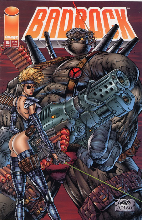
5. Hidden feet, because drawing is hard.
6. Characters standing on different levels of an unseen surface.
Seriously, unless Badrock is walking on Cotton Hill stumps his leg should go down another ten feet.
Out of all of that, my favorite part of this is the lady aiming a gun (with a LASER SIGHT) at the ground while she looks over her shoulder. In an eye patch. And she's kind of a robot! Shouldn't that green line be going through Badrock's leg? Hey lady, you wouldn't have to wear pouch belts around your waist and leg if you put on a pair of pants.
35.
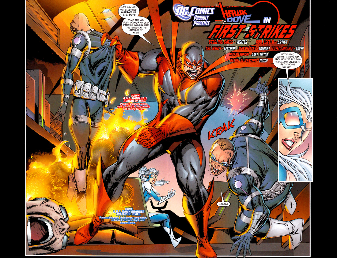
These pages, from the relaunched "Hawk & Dove," were drawn in 2011. In 2011, Rob Liefeld had been drawing comics professionally for 25 years. In the years between 1986 and 2011, not once did an editor crack open a FedEx package containing Liefeld's art, slide out the inked pages, and say "what the shit am I looking at." For 25 years, just "Beautiful! Send this to the letterer! Wouldn't change a thing!" So I guess what I'm saying is...maybe Rob Liefeld isn't history's greatest monster?
Haha, what are you talking about? Of course he is. Check out the guy being held aloft by Hawk here. See those two claw-fingers grabbing the front of that lifeless body's shirtchest? Those are meant to be Hawk's thumb and index finger. Which means that Hawk is essentially holding him like a pencil. Look at Dove sort of emerging out of the driver's seat in the cockpit, rather than appearing to turn around and look behind her. CRAZYLEGS DOVE, that's what they call her. And of course, let's not forget about the decapitated mostly-a-head in the foreground, whose WIDE-THE-FUCK-OPEN mouth indicates, in Liefeldian shorthand, that the man is either unconscious or dead.
34.
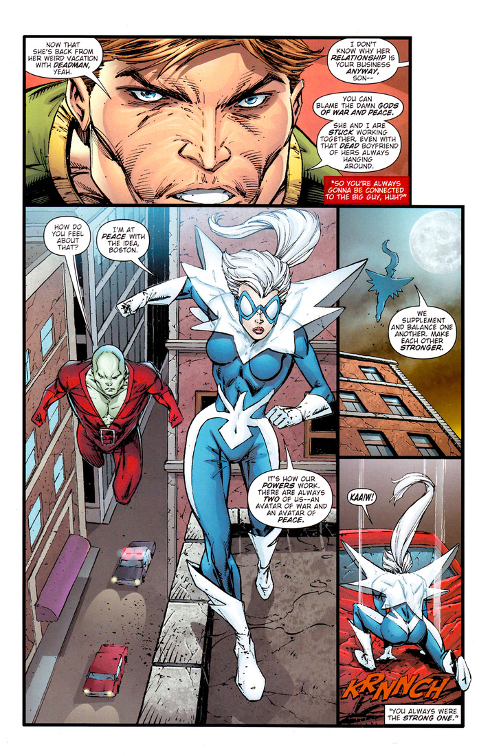
Again, this is from 2011, but it contains the same bag of tricks that our hero has employed over the last 25 years of his insanely lucrative career.
- A face covered with so many lines and angles that it actually looks like three or four faces on top of each other
- Vague 90s haircuts, including his standard mushroom-haircut "hair on the sides of your head is dumb" and "short hair, but a nine-foot ponytail." There is a reason that 90% of Liefeld-created characters include some sort of head-sleeve that only shows the top of the head and leaves an opening for a ponytail. (It is because Liefeld hates us.)
- Flying character keeping legs akimbo so feet don't have to be drawn
- Lots of straight lines, but then shit placed on top of them so all the perspectives are fucked up and nothing seems inhabit the same plane of existence. Check out the car and the cop car in the first panel. It's like a Magic Eye painting)
- Motion lines trying to trick us into something happening. "Hey, I'll draw Dove doing a lunge and then I'll draw a crumpled car hood on a different layer in Photoshop! Flawless."
33.
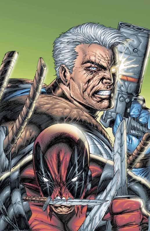
If Deadpool's teeth are where they think they are, and his eyes are where those white eye holes are, where the hell is his nose? Why is he carrying a knife in his teeth if he's got two other knives in his hands (helpfully held up to his head so we can see them)?
I know Rob loves his characters to look tough, but he really needs to cool it on the Matrix "we will carry EVERY weapon" thing. Deadpool has (counting his sword ... or at least what I'm going to assume his a sword, and that I'm going to assume is his) four visible knife-like weapons on display and we only see him from the collarbone up. Cable is carrying a gun (pressed to his face) and has two swords of his own. So that's six swords and a space gun with two holes for the bullets or lasers or whatever to come out of on what is more or less a pair of character headshots. I want Rob Liefeld to get a gun pulled on him in real life and shrug it off because the mugger doesn't have a set of steak knives fashioned to his vest and didn't try to mug him with two bazookas strapped on his back. I would also like to see Rob Liefeld punched in the face.
Look at Cable's left shoulder. Now look at where his left hand and forearm are. Either Rob forgot which arm he was drawing and drew it backwards or How To Draw Comics The Marvel Way has a "draw the arms wherever you fucking want" chapter I missed.
32.
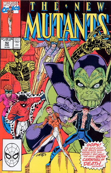
"Oops! We accidentally left three visible feet on this cover. We covered three of them with Spider-Man's head and one with this exclamation balloon. Enjoy Cannonball! His power is turning his feet into speed lines."
New Mutants 92's cover is a great exercise in trying to figure out what size everyone's supposed to be. And what's going on with Warlock's arm? I know you get a little leeway drawing a character like that, but come on, you can't fuck up an "everybody jumps" thing by making his arm come up out of nowhere like that. And where does his body go? Does it fit neatly behind Sunspot with the bottom half of Boom-Boom's legs?
Let's take a moment to remember one of the finest Liefeld tropes: the flat crotch with the weird Spider-Sense lines around it. Everyone in the Robverse wears super tight pants and has action figure crotch. Even the guys in drum major jackets.
31.
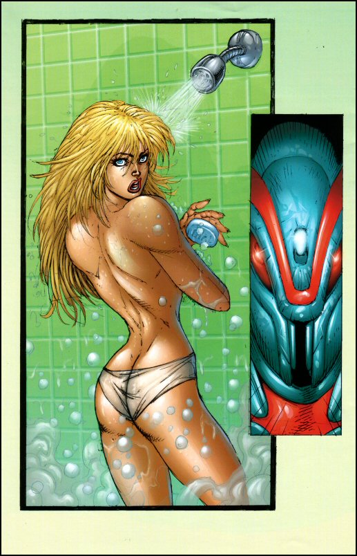
Re:Gex is a comic regarding Gex, wherein someone gexes and then must gex again.
In all seriousness it is a comic about a "band of mutants" including a magician named Genie and a swordsman named fucking Beowulf and the most interesting thing that happened in its two issues counting a number zero and 35 alernate ashcan covers is this horrible drawing of a lady being scared by a robot in the least believable shower ever.
Look at that thing. She's completely dry, first of all, despite the fact that water is spraying her in the side of the head. It also STOPS at the side of her head and doesn't go anywhere else despite the thigh-high amount of steam building up and the random bubbles rising to the ceiling. To make things even worse, she's showering in panties and is dropping the soap, because sex. And her shoulders are four times wider than her hips. And she's casting a huge shadow on the wall, meaning the light is coming in I guess from the bottom of her shower. And she's wearing lip liner, I think. Oh and also THIS PIECE OF SHIT IS IN A PUBLISHED COMIC AND WAS DRAWN BY A MILLIONAIRE.
Comments
OH MY CATS
A SEQUEL
A SEQUEL
A SEQUEL
A SEQUEL
A SEQUEL
A SEQUEL
/waves horribly misshapen hands in the air
By Andy Hutchins on 06.14.12 11:52am
Two things:
#39: How about the fact that three people have the same face, all next to each other?
#38: I actually owned that comic and never noticed just how awful the cover was.
By Big Blue Barrister on 06.14.12 12:03pm
Crap, not #38.
#32.
By Big Blue Barrister on 06.14.12 12:04pm
Oh, and to be fair
At least two of the characters on that New Mutants cover are supposed to be shrunken (which becomes clear through the story) and so the scale issues aren’t quite as awful as they seem.
By Big Blue Barrister on 06.15.12 11:29am
Please do this regularly.
It’s such a great series. Halfway through, I think, “certainly there’s no topping this drawing” and there are always some so much worse.
By Sibley on 06.14.12 1:10pm
Well, apparently I have no idea how to format numbers in a post without them turning each into a new list. Those should have been #26, #19, #13 #12, #7
By Sibley on 06.14.12 1:14pm
#40 (Captain America)
Are those lens flares, or are they supposed to be bullets being deflected off his shield?
Not to defend Liefeld, and I know it ruins the joke, but still … fair is fair.
By Alessandro on 06.14.12 6:57pm
No, they’re flares. See every other picture Liefeld drew of Cap’s shield.
By Brandon Stroud on 06.14.12 7:56pm
If they were bullets, Liefeld probably would have drawn speed lines to indicate the bullet’s trajectory.
By Sibley on 06.15.12 3:19am
What is Shaft even sitting on in #23
Is he just squatting to take a deuce?
By The 984 on 06.14.12 8:43pm
I will never EVER tire of these
By Corky Kneivel on 06.16.12 12:13pm
Those panels in order: 28, 16, 21, 19
Later on Miss Sexy Thigh Scraps has blood circling her thigh. Because Heaven forfend a thigh should go un-circled by something.
By Corky Kneivel on 06.16.12 12:15pm
thank you thank you thank you
You are a blessed, giving, beautiful man. I’ve hated Leifeld’s “work” since I first started reading his shit in the ’80’s. I’ve hated the way he draws hands, I’ve hated the way he draws feet, I’ve hated the way he draws figures, I’ve hated the way he draws people, I’ve hated the way he draws lines, I’ve hated the way he draws, period.
I NEVER understood his popularity, and I’ve only read his comics for the story/writing and grimaced much like his characters when discovering a new panel disaster.
Thank you for making me understand that it wasn’t me, I wasn’t somehow not capable of understanding his hidden genius, and that the guy just cannot draw worth shit and that it’s incredibly fun to laugh at his garbage.
Thank you so fucking much.
By mariospants on 06.29.12 12:50pm
Bloodstrike1
This is from Bloodstrike#1 , always messed with my head as a kid.
Sgt. Badguy is getting the crap shot out of him, but the way it’s drawn, it looks like he’s only being shot on the left side of his body. He could have just stuck with the 2d image he was going for and it would have at least made sense to the eye, but whatever.
By Fredrickson on 06.29.12 1:46pm
heres the link
By Fredrickson on 06.29.12 1:47pm
wtf
[IMG]http://i46.tinypic.com/17erzn.jpg[/IMG]
http://i46.tinypic.com/17erzn.jpg
http://i46.tinypic.com/17erzn.jpg
the shots are… going behind? only hitting the left side?
By JohnsonMcgee on 07.05.12 1:57am
Much that is wrong with comic books comes from this man...
Where does one begin?
He’s not the only person to take muscles to a hideous extreme, but he’s one of the worst offenders, and one of the most influential. And then there’s the blatant misuse of spandex, gone horribly, horribly wrong. You’ve got a problem when your characters have more extreme muscles than pro-wrestlers and less taste in fashion.
Big, ugly-ass boots and shinguards… look at Chapel in 39. No wonder he’s sad, he’d barely be able to move in those things and they make him look like a clown. And Chapel is not the only Liefeld character to sport such ridiculous footwear… you see it over and over again in these pages.
Or how about the boxing-helmet thingy? Prophet, Warchild, Beowulf, Shatterstar, Shaft… even Psilence is wearing a girlie version. The #1 example features three people in the picture wearing the damned things…
He’s also fond of pinheads… how many characters does he have with a mask that makes the head look like a smooth dome (usually with a stripe running down the face)? #1 picture has 4 if you include Bedrock (he’s not wearing a mask though).
Or how about the fact that his faces look exactly the same… so much so, that in many places it looks like he traced two of the identical face, side-by-side? You can see it again and again in these pages, male and female, but the #1 picture has a good example with the two guys in the middle (the guy in blue, and the guy in brown behind him). They both have identical squinty-eyed expressions. #30 is also good. Cyclops, the guy below him, and Charles Xavier all look like the same face with slightly different hair/costuming.
Or how about the horrible, godawful names? Shaft, Combat (really?), Shatterstar (aka Shatty), Bedrock (complete with cheesy Flintstones references), Re:gex, Psilence… Knight Saber?
It’s all bad.
And that wouldn’t be a problem, except for the fact that Liefeld is still getting paid megabucks to crank out crap. Thankfully, stuff like this helps spread the word.
By josh.tiscareno.7 on 07.14.12 2:56am
F**king Hilarious.
I don’t have anything to add other than just to say that I’m a comic book artist myself and I’ve always been extremely critical of my own work and artists like Liefeld that never seemed to learn the fundamental basics of something as important as human anatomy and correct proportion, really gets under my skin. And all the things that you point out and hilariously dissect are very specific in his art and the problem is he doesn’t seem to care to correct. This was a great read, extemely funny stuff.
By SugaRay on 07.14.12 4:03pm