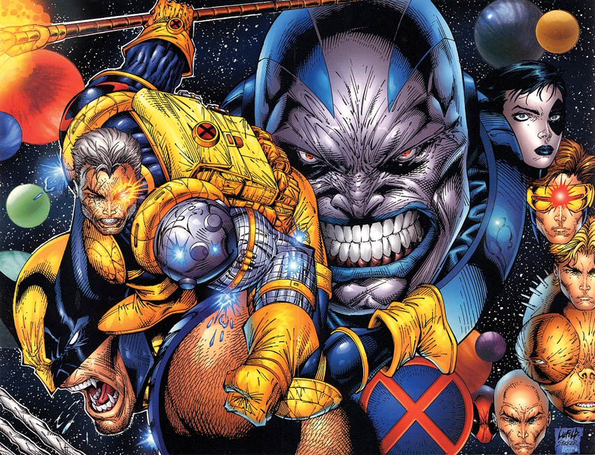
-format(webp)/cdn.vox-cdn.com/assets/1185298/Youngblood24.jpg)
30.
29.
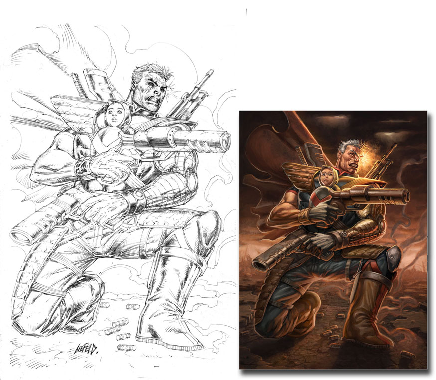
This one is a bit of an experiment. Would Rob Liefeld’s art somehow look even worse as a painting than as a…well, whatever the hell it is that you can call his normal shitassery? Here we have empirical evidence that, yes. Yes, it would look worse. In the original ink drawing, you have a piece of art that, while still reeking of Liefeldian problem areas (elephant foot, bendy guns, elements of the composition plainly drawn completely out of order), it’s not really THAT bad. That all goes out the window when the drawing is given the Thomas Kinkade treatment. (Heh, more like BLAH-mas Kin-LAME, am I right) (too soon?)
Gaze into painting-Cable’s grey horse-mouth, ye mighty, and despair.
28.
27.
This guy, if you can believe it, is named "Beowulf," because of course he is. He’s from a comic book that Rob did called "Re: Gex" which was part of a comic book company Rob founded called "Awesome Comics." It’s all the perfect storm of the most creatively-bankrupt horseshit you’ve likely ever heard.
The worst thing about Rob Liefeld (by which I mean "one of the attributes of Rob Liefeld") is that he refuses to make any adjustments to his art. Motherfucker has never owned an eraser in his entire life. Never needed one. He draws the fist, draws the sword handle, draws the hilt, then decides he wants the blade to be pointing in a different direction. Rather than just shrug and have the blade follow the line of the shit he’s already drawn, or erase what he’s drawn and rearrange it to conform to what he wants, he rolls his eyes, repositions his backwards-facing baseball cap, and draws the blade HOWEVER THE FUCK HE WANTS. No word on whether he takes the time to say to the picture he’s drawing, "You know who the fuck I am, drawing? I’m Rob. Fucking. Liefeld. The blade goes where I say it goes."
Here is the plot of "Re:Gex" from Wikipedia:
"The world is ruled by a dictator named Lord Sharpe. Fighting against his rule are a band of mutants and cyborgs called Re:Gex. They are led by a man named Scarab. Scarab previously worked for Lord Sharpe but rebelled against his master when he encountered an angel during one of his missions."
And that’s the story of how Rob Liefeld made a billion, trillion dollars and is 20 times more successful than anyone reading (or writing) this will ever hope to be.
26.
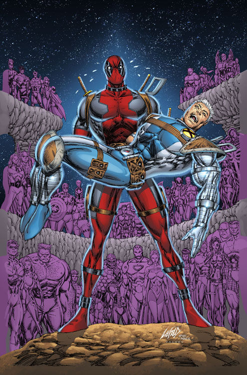
Ugh. This is a clear-cut example of Liefeld having no idea where to pick his battles. This cover is plainly an homage to the iconic "Death of Supergirl" cover from Crisis on Infinite Earths, but Liefeld decides to half-ass the joke piece. That’s all well and good. Half-ass the joke piece, Rob. You half-ass most other stuff.
But the issue for me is that he only half-asses the focal point of the piece: the two central characters. You know; the iconic part that is being mocked.
Take a look at those background characters. There are a ton of them. Despite the fact that the vast majority of them are hilariously off-model (a Liefeld drawing, by rule, is off-model by default, never moreso than when he is drawing a character that he invented, whole cloth), he clearly put a ton of work and effort into the background, making every character recognizable, distinct, and detailed. Then he gets to the foreground and says, "Eeeensh, SO TIRED."
Rather than take a nap, or wait til the next day, or call the publisher and tell them the cover will not be ready on time (which is probably one of the things that Liefeld is the very best at in the world), he just goes FAAAAAART and sprints through Cable and Deadpool. He forgot to draw a second leg for Cable, so he quickly added in a second kneepad and Foot-Type Leg Ending ™, didn’t bother drawing a second arm for Cable, didn’t bother drawing arms for Deadpool, added in some Lil’ Archie-style tear drops, made it so Deadpool’s legs go straight up to his navel, and went with the merest of Jack O’Lantern faces on Cable. He made sure to get his patented WIDE-THE-FUCK-OPEN mouth that he thinks is associated with unconscious or dead people. Can’t forget that.
25.
24.
Blech, GROSS.
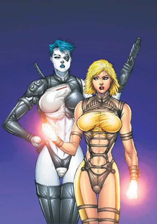
Okay, I know that superheroes don’t actually exist. I know that. But if they did exist, and unrealistically-proportioned women chose to enter into superheroing, there’s no way – just no way – that they would ever choose any outfit even approaching this. What in the fuck, seriously. Even Power Girl’s notorious boob window seems utilitarian next to swaddling your gazongas in saran-wrap and flopping them out over your bondage harness. That ain’t practical, fellas. And good god, we are already aware they’re ladies, Rob. You don’t need to highlight the exact place at which the mons pubis becomes the vaginal opening. Go to hell.
23.
22.
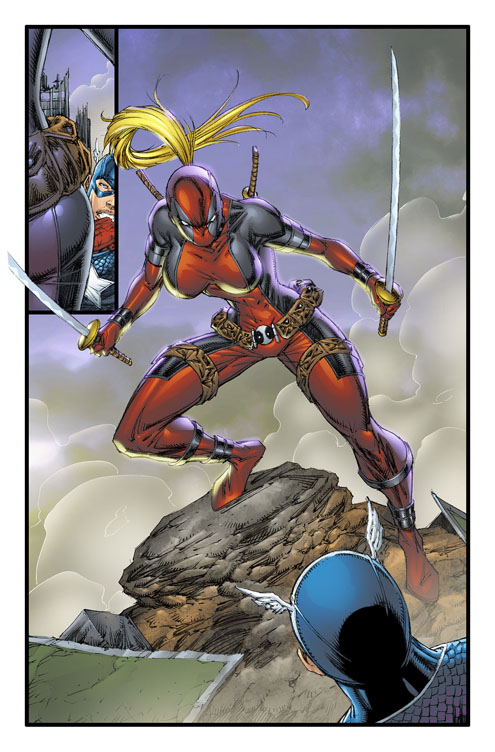
Oh good, more boob-floppery. I’m rolling these two pages from the introduction to "Lady Deadpool" into one entry because they’re inseparably bad and we all need to experience the pain together. The tiny panel in the upper left is perhaps the debut of the OPS, or "over-the-pouch shot." Now that’s how you do a fuckin’ ROB LIEFELD REVEAL, chumps. Jesus, get a load of that woman’s dimensions. Is your left calf supposed to be slightly thicker than your waist? I submit to you that probably not.
On this second Lady Deadpool page, it’s important to pay attention to the bottom-right-hand panel. You know how Rob Liefeld thinks someone would take a mask off? By grasping one side in a fist and steadying the other side against the face with the fingers of your other hand. Perhaps he thinks that a mask is removed by slowly worrying it upwards on the face, because that is what is happening here.
21.
I've been staring at this for 20 minutes trying to figure out why Cable, a guy born with telepathic abilities, couldn't figure out that he should take off his white-ass dinner glove before cutting open his hand. I guess then he'd have to redo his wristbands and that'd just be too much trouble.
Loading comments...