-format(webp)/cdn.vox-cdn.com/assets/1185298/Youngblood24.jpg)
10.
Oh, Robert! Your tawdry escapades will certainly go down in the ribaldry hall of fame!
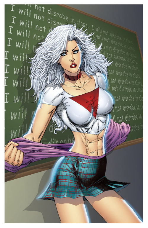
I don’t even know what sort of clothing Suprema (yep) Is meant to be pulling off/removing here. Perhaps she is merely pulling taffy while wearing her skirt. That’s probably it.
If I were Suprema, I would never stop screaming I would probably get my front-spine checked out, as well as my broken clavicle and my extremely narrow set of abs between two of my larger sets of abs. Because that is probably a hernia.
9.
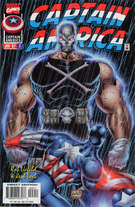
Captain America's shield is lens flaring IN THE RAIN AT NIGHT.
8.
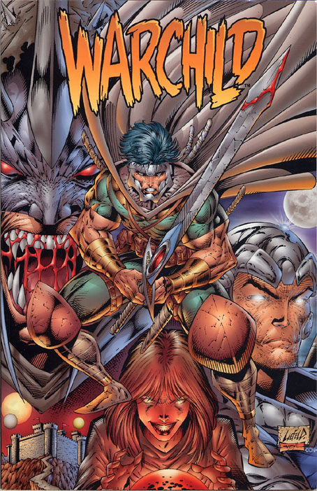
Here is a brilliant, BRILLIANT (read: catastrophically horrible) example of "Liefeld likes to draw shit out of order." In the original pencil drawing for this cover, do you imagine Warchild was ever meant to be holding a sword? Or that sword, at any rate?
- Extend index and middle finger of right hand. Bend slightly at first knuckle
- Clench fingers and thumb of left hand together like you’re making a chicken’s head with your hand
- Press right and left hand together
- NOW HOLD A FUCKING SEVEN-FOOT SWORD
Once again, the blade of the sword doesn’t even come close to meeting up with the handle of the sword, but I guess when you’re adding it all in after the fact, it doesn’t matter. Oh…oh no. He…he was holding his wang in the first draft, wasn’t he? Just pointing his peener right at the audience.
Also what is going on with the blood in that guy’s mouth in the background? Does blood form in a web and I just never knew that before? Holy shit, I can’t believe Rob Liefeld never "invented" an "edgy" version of Spider-Man called "BLOODWEB." He could have a shitty haircut and pouches, or something. Maybe have a couple of swords on his back and carry a gun that looks like a hair drier. I dunno, I’m just spitballing here, Rob. You’re the professional.
7.
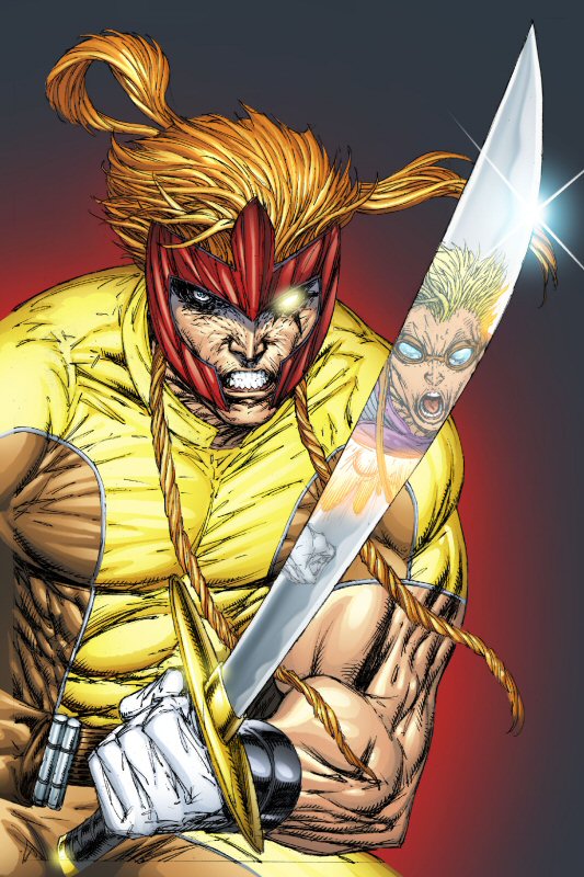
I WILL FLEX SO HARD I WILL BEND THIS SWORD
AND ALSO CLENCH MY FIST IN SUCH A WAY AS TO HAVE THE SWORD HANDLE COME OUT OF SOME INDETERMINATE POINT SOMEWHERE ON THE OTHER SIDE OF IT.
Let’s not deal with the angle of the sword and the angle of the reflection and exactly what course Cannonball is taking towards Shatterstar and/or his sword. It would take too long and be too big of a headache and nobody cares (least of all, Rob Liefeld), so let’s just agree "lol" and move along to the next talking point.
Rob Liefeld will just keep adding lines to shit. Just keep adding lines and keep adding lines and won’t stop until his pen runs dry or his assistant comes by and wrestles Rob’s arm free of the drawing board. No person exists with that amount of striation in their muscles. No one. Look at how many side-abs he gave Shatterstar. It’s like a bowl of peanut M&Ms.
Let’s take just a moment to talk about composition for a moment. At first glance, you think, hey! The sword comes to the foreground and gives space to the character in the reflection. The negative space suggests the offscreen character. But no. It doesn’t. Liefeld just found a way to draw less. "Hey! If I move him over HERE, I only have to draw one arm and just part of one thigh! I don’t even have to draw a second hand! Second hands are tricky, because the thumb is on the other side on the second one. No one will even notice that he’s just sort of awkwardly standing there with his sword held over his ding-dong area and flexing the shit out of every muscle. It’s the perfect crime!"
6.
5.
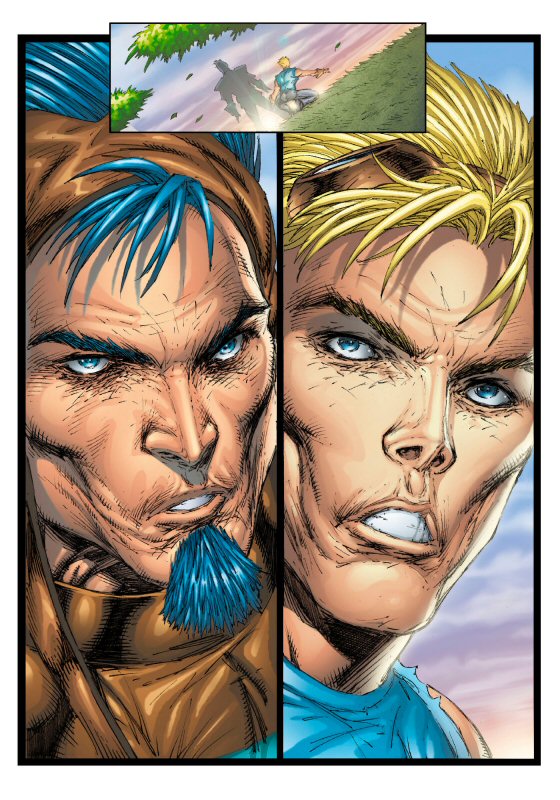
Modern-day Liefeld occasionally goes for what he feels is a more photorealistic approach. Except that his version of "photorealistic" usually translates to "crinkle-faced, horse-skulled pig-snoutery."
The guy on the right is Sam Guthrie, AKA Cannonball, who is supposed to be anywhere between 17 and 25, depending on who is editing the comic. The guy on the left, I don’t know, so we’ll just call him Soul Patch Jones. I don’t know how old Soul Patch Jones is supposed to be, but I’m going to guess significantly older than Sam. Because he’s tanner. There’s literally no way to tell any sort of age difference between these characters. They look like they’re both 80. Cannonball looks like Morgan Fairchild looked into the Ark of the Covenant.
This is Liefeld’s idea of an ideal face, everyone. A jawline you can slice roast beef on and eight-inch cheekbones. Skin like onion paper that’s been pounded with a meat tenderizer. A philtrum you can store a cashew in and lips the texture of Red Vines. And of course, floppy bangs.
4.
3.
This is the prototype of "that" Captain America drawing, and I honestly can’t decide if this is worse, or better. What sort of reference guide so you suppose Liefeld looks at for drawing musculature and anatomy? Ha! I’m kidding, of course.
"Hey dudes, how many abs are on a guy? Like a million? Shit, wait, what do abs look like? They’re like those small, edamame-looking things, right? I’ll just stick those in there. Nice. Hey, how do veins work? They’re all criss-crossy, right? Heh, what am I talking about? They gotta transport blood everywhere, right? So they probably just intersect and overlap all over the place. Easy as cake. Hey, come over here. How does a shirt look where the arm meets the chest? What’s that? ‘Like a cat’s asshole’? Hey, makes sense to me! Crud, I’m getting kinda close to the deadline here. Knew I shouldn’t have waited until the day before "YOUNGBLOOD: STRIKEFILE" #5 went to the printers. Well, I’ll just sort of fade ‘im on out down at the bottom here with some crosshatching. Whoops, no time to cross; just "hatching" it is, then. No one looks at the bottom of drawings, right? Thought so."
2.
1.
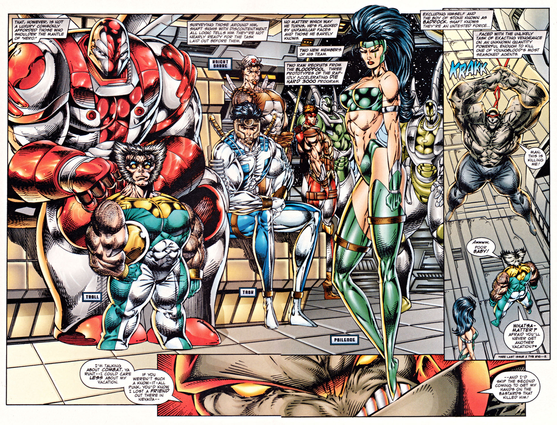
Hoo boy. This is it. This is the mother lode. The perfect storm of every Rob Liefeld criticism all sitting there in a jumble of tumorous musculature. You've got the tiny feet, the hidden feet, the people balancing on their tiptoes because drawing is hard, the awkward "chest-and-ass thrust out as hard as possible in opposite directions at all times" poses, the inconsistent perspective and sizing where everyone is either twenty feet tall or five feet tall or the entirety of reality is in flux oh my god what is happening I can't feel my face.
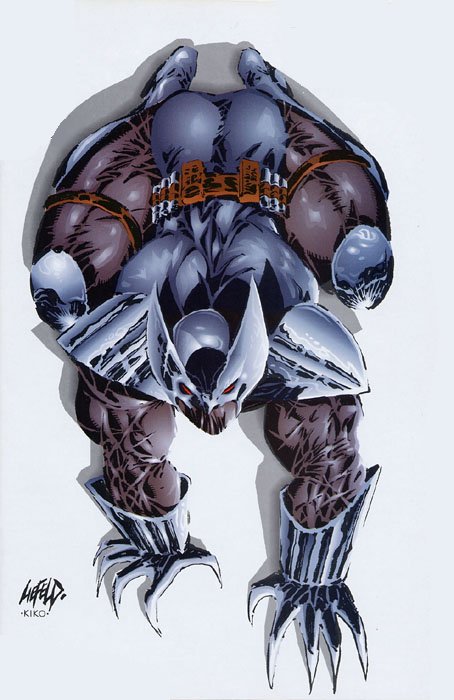
The real crux of this piece, of course, is "Troll." Liefeld took Wolverine's head and slapped it on Puck's body and then gave him hooves and filled him full of horse steroids and gave him a uniform that bunches up like crazy around his dick for some reason. Troll is supposed to be holding a helmet under his arm in the first panel, but the only reason you know that is because I just told you. If I hadn't told you that, you would assume the gold area under his arm is just part of his costume and that his arm terminates suddenly in a near-90-degree angle. I know I'm weird, but when I have one arm bent in toward my body and the other arm hanging by my side, they're not the same length.
See the lady standing on tiptoe for no reason? Her name is Psilence. PSILENCE. No further comment is needed. PSILENCE.
Please take a moment to enlarge this so you can check out Shaft (guy in background, in red, to the left of PSILENCE). His top half and bottom half are stuck together at opposing angles. Check out how his legs sort of trail nebulously off behind the foreground bench. And where Liefeld couldn't avoid it: one tiny foot.
The only things keeping this from being the perfect Liefeld drawing are 1. woeful lack of pouches and 2. only six of the nine characters shown have shit strapped to their backs.
Loading comments...