
The Topps Big Exhibit.
written by Jon - march 16 - 2004
The 1980s was a golden decade for many things, one being the baseball card industry. It was the first decade in which card collecting was taken seriously, yet just before the hobby was ruined by overweight men in Yankees mesh-back ballcaps who spat when they talked. Though the baseball card was gaining economic strength against the U.S. dollar, at this point the hobby was still primarily about fun rather than dollar signs. Topps, the leading card manufacturer at the time, decided to make an effort to capitalize on the hospitable climate by producing a new, innovative type of baseball card, one that would spread a buzz of excitement throughout the industry.
Instead, they came up with a set called Topps Big. Topps Big was the type of card that you would tape to the spokes of your bike without opening the pack. The lone redeeming feature of this set was that doing so would yield a satisfying THUK THUK THUK when you rode down the street, rather than the thickity thickity thickity offered by your average Mickey Mantle rookie card.
It hardly takes a card collector to understand why Topps Big was such a worthless set. First off, the cards were oversized. Not oversized enough to be cool, and barely enough to be noticed at first glance. Yet when you tried to stuff your Bip Roberts into a card holder, it wouldn’t fit.
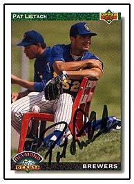
Not that anyone would have wanted to waste a protective case made of hard plastic on these cards. As any kid who collected cards during those days knew, protective card holders were tough to get hold of. One could buy them at the store for a few dollars, but no well-adjusted child would pay five dollars for a few cases when he could put that money toward ten or so packs of baseball cards. And even if one had plenty of cases, it wasn’t worth wasting on a Topps Big. Its packs came in big plastic packages found in Toys R’ Us that included a bunch of Country Music Stars cards, a supersized Dave Winfield card, and a Pat Listach autograph. Listach, the 1992 National League Rookie of the Year winner, signed enough autographs to ensure that every Wal-Mart in America had about a hundred of these wretched value deals with his signature proudly displayed in the package below the “$500 IN VALUE FOR ONLY $19.95” in boldface Impact font. The result was that his signature devalued so sharply that midway through the 1994 season, his bank stopped cashing his paychecks after he endorsed them. The value of his autograph hit the floor when the U.S. Treasury Department claimed that its worth was actually in the negatives, and taxed poor suckers like myself five dollars for every year we owned it.
Estimated 2004 value: $-10 and a knee
to the crotch
Maybe it was simply because every one of these big plastic grab-packs contained a Pat Listach autograph. At any rate, they were full of cards that you would stuff in the pockets on the inside covers of your baseball card binder.
But the most memorable thing about Topps Big was not its low value or its unnecessarily cumbersome size.
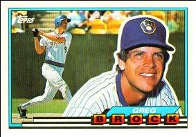
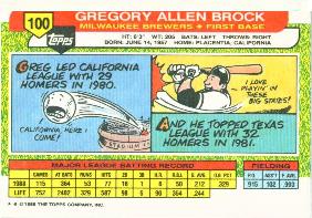
Other than the eerie notion of a player having a picture taken while a clone of himself is playing baseball behind him, there's nothing really noteworthy about the front of the card. The reason people remember this set is the crappy comic featured on the back of every card. These comics were on about the same level as a one-panel comic of Mort from Bazooka Joe rapping about why the hell his sweater goes halfway up his face.
THE TOPPS BIG GALLERY:
FIVE POINTS OF INTEREST
POINT OF INTEREST #1
The player is
always drawn as a white guy.
Maybe the people at Topps were racist bigots, but my guess is that the cartoonist just decided that black guys were too hard to draw, so he went ahead and just drew everybody white. This would not have flown a decade later, when you can open any algebra book and see a black kid in a wheelchair solving a bi-variable equation with an Asian girl, an ambiguously dark-skinned boy holding a soccer ball, and a homosexual ape with orthodontic headgear. For instance, the following card would have been met with a firestorm of controversy.

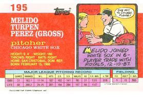
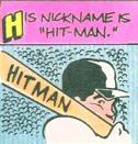
Melido Perez is probably the blackest motherfucker in history, but whoever drew him chose to omit the noticeably dark complexion and geri-curl so he could draw him to look like Bob the Builder. Apparently he also turned a blind eye to the fact that his name is Melido Perez, which is just about the least white name I can possibly think of.
POINT OF INTEREST #2
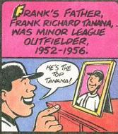
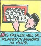
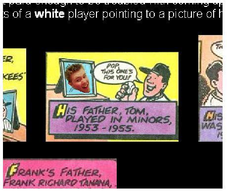
It is always both amusing and noteworthy that a
particular player's father once played baseball.
Since the cartoonist was evidently not paid enough to be troubled with coming up with an original joke on every card, most of them were conceptual repeats of a white player pointing to a picture of his dad and saying, "My dad!"
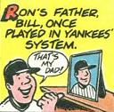
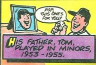
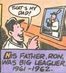
Note the second pic on the first row. Either that guy in the picture is a hideous, blue-shirted hunchback, or Tom Brunansky was fathered by a floating head. Or some schmuck stopped to stick his head in the hole of one of those PUT YOUR FACE IN A CRAPPY 1980S NOSTALGIA ARTICLE photo backdrops that you always see at carnivals.
WANTED
DEAD OR ALIVE
I CANNOT WAIT TO MAIL THIS TO GRANDMA
POINT OF INTEREST #3
Taking baseball terms literally by drawing
players actually picking up and carrying bases is a great way to make jokes
about stolen bases.
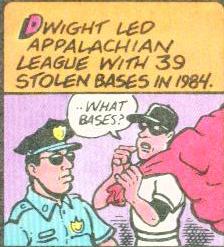
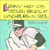
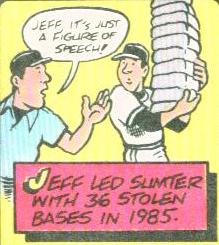
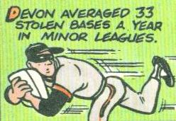
Like Topps Big, everybody seemed to forget about the concept of the stolen base after the 1980s. At some point during the 1990s, baseball became less about strategy and athleticism, and more about Mark McGwire drinking steroid milkshakes until his testicles shriveled away so he could hit a baseball 75 miles and get pushed around the bases in a wheelchair. Coaches never tell their players to steal bases anymore because baseball is evolving into a sport in which running is unnecessary, since all that a batter will ever do is strike out, walk, or hit a home run. Players like Rickey Henderson and Vince Coleman will be rendered obsolete and carted off to the factory to be made into glue.
POINT OF INTEREST #4
Subtlety and creativity are vastly overrated.
The cartoonist obviously had "drawer's block" when he made these. As much as I'd like to make fun of him for it, it would be very hypocritical of me, as I can completely relate. Lord knows that I've had some writing moments that weren't exactly flattering. Below is my start on an article about the Olympics that's been sitting on my hard drive for a year:
Olympics.doc
I went to the Olympics as a kid. As
- Muhammad Ali
- The Olympic bombing in Atlanta (Richard Jewell? more like Richard FOOL)
-
There are many aspects of
000
00
The Olympic logo looks like the crotch of a man who has five testicles, perhaps that
word word word word word word word word word word word
-Personal experiences -- went to 1996 games in Atlanta
get nick from backwords to photoshop simon cowell into judge's table
RUNDOWN OF OLYMPIC ATHLETES
Kerri Strug more like kerri strung-out on crack
Dominique Dawes more like c
----------------
Carmen Sandiego =
Lesbian!!1
written by Jon
Expect a post about how the Olympic Games are more like the Olympic GAY-mes in summer 2009.
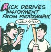
POINT OF INTEREST #5
It is hilarious when baseball players do things
other than play baseball.
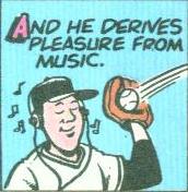
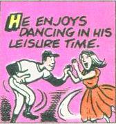
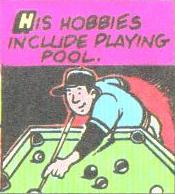
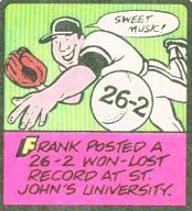
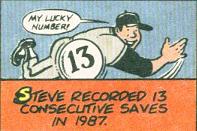
The humor of these comics relies solely on the fact that he's wearing a baseball cap. That way, you know he's a baseball player and not merely a person who listens to music professionally. Part of me wonders what would have happened if Otis Nixon said he derived enjoyment from applying cocaine eye drops and making unwelcome advances toward white women. I like to think that nobody could be dense enough to draw Otis Nixon as a doughy white guy.

WHY DON'T YOU BOB THE BUILDER
THIS BITSH
- Jon
Jon@progressiveboink.com
AIM: Boiskov